Thursday, April 30, 2020

Got the Blues?


I was thinking this morning about the color blue and it’s use in our paintings.  It’s the most used color for skies and water, but also can be used for bounced light in shadows and as a color to cool down warmer colors. 

Paintings that have a large percentage of their canvas designated to sky or water can run the risk of having the painting look humdrum if there isn’t enough variation of color and may result in loosing the viewer’s attention.  Yet, there are many options to add variations to create movement and shifts of color to keep the eye engaged.  

For example the sky has what is known as a sky vault, where a lighter value is noticeable at the horizon and darker directly overhead.   In addition, the sky closest to the horizon will many times pick up some of the color of the ground in particle reflection.  Also, there is a temperature shift that occurs from East to West depending on where the sun resides at the time of observance.  This is especially evident in late afternoon sunsets. You can see some examples of these phenomenons below. 


There is always opportunity to move color around in a painting’s sky.  
Consider interlacing colors other than blue; how about pinks, violets, grays or greens?  
Below are a few examples of how artists added freshness into their skies with interplay of color.

 
detail: Armin Hansen

detail: Derek Penix

detail: Jennifer Moses

detail: Colin Page

CW Mundy

 
CW Mundy

As for water, there are also many scenarios that allow you to add variety to your blues. A few examples might be – the depth of the water (deeper water versus shallow), still water versus moving water, tides or color reflected from it’s surroundings.  The weather can also offer options to help modify the blues in bodies of water, or in the sky for that matter.  The idea is to look for possibilities that allow you to manipulate color. 

Here are some examples of how artists created an excitement in their water:


detail: J. Lipking

CW Mundy

detail: C. Aspevig

unknown artist

C. Aspevig

A. Patrisi


Now, a look at one way we can play with blues.  In this exercise, I concentrated my mixtures with 2 blues:  Ultramarine and Prussian blue.  You can make a simple grid on a canvas panel or a canvas paper.  I used a flat brush, which helps keep my edges sharp.


The Left side is mixtures with Ultramarine and right side with Prussian.  Top corners are the color pure with white.  My mixtures include random colors chosen from my palette, although you may want to work in some order.   Document your the mixes on a separate ledger if you wish to keep track of what colors you used.

It is a great exercise to do… and I encourage you to experiment.  If you don’t have Prussian blue, pick other dark blues you typically use and work to create variety.  One point I will make is that Ultramarine and Prussian Blues are both intensely dark and transparent, meaning the range of values you can create with these colors is tremendous.  Ultramarine leans toward a blue violet and Prussian toward a bluish green.  In these mixtures, I have kept blue the dominant color.  You can choose any value to work with in this exercise.  I kept them a middle value by adding a small amount of white, but you could certainly work lighter by adding more white- just keep each of your mixes as close to the same value, as possible. 

As a side note:  My Mother, an artist herself, always warned me “NEVER use Prussian blue”.  She insisted it was too powerful a color, and would stain every other color and take control of the painting.  So for many years I avoided it.  However, it is a beautiful blue much different from Ultramarine and I found it worthy of a place on my palette.  Look at the artists that embraced Prussian blue:  Sargent, Monet, Picasso, Zorn, Van Gogh and Sorolla to name a few (GREAT ones!).  I quickly learned to listen to advice, but decide what works best for me and forge forward.  The key to every color is to learn it’s potential… which means to  play and experiment with your paints.


Remember there are no rules in painting.  There are good guidelines to follow, but rules can sometimes stifle our creativity.  I offer the above information as my own thoughts, only to foster ideas.  It is up to you to create and paint with your own voice.  

Monday, April 6, 2020

Color Matters- Limited Palette

In my last post I suggested trying some new colors that would alter your color mixtures resulting in a fresh new look for your paintings.

In keeping with the theme of color… I want to talk a little about using a limited palette.

You might be aware of the artist Anders Zorn and his limited palette.   It is believed he used Yellow Ochre, Cadmium Red medium, Ivory Black and Titanium White.   These are the colors he is famous for using to create so many of his harmonious and beautiful figurative paintings.  His flesh tones are beautiful.


Lets explore limited palettes using primaries.   I have 2 different palettes; each one will allow you to create a wide range of very saturated colors.  I just picked colors I had on hand.   Hopefully this information will help you choose the right colors to create the painting you envision.

First it is important to understand that in achieving bright color mixtures, you must begin with high key tube colors.  (Makes sense- right?)  


Palette 1:

Cadmium yellow Lemon- This is the cleanest most pure yellow. All Cadmium Yellows are a variation of the pigment PY35  (A cooler yellow color, Cadmium Lemon is a single pigment color with excellent tinting abilities. Cadmium was discovered in 1817)


Alizarin or Madder Deep- These colors are not stable unless labeled Permanent.

Madder Deep is a pure red violet, dark and transparent.  It was originally extracted from the Madder plant and has been used since the 7thc BC.  The pigment color is PR264

Alizarin Crimson is slightly different from Madder.  It is a synthetic Lake pigment also from the Madder plant.  It was the first natural die to be synthesized in 1868.  Also a deep value and transparent.  Pigment color is PR83

Prussian Blue.  Dark and transparent.  It was made by German Chemist Diesbach around 1704.  It was the first synthetic blue pigment and quickly gained favor as an alternative to the very expensive genuine Ultramarine.  Pigment color PB27.


Lets look at what some of these mixtures look like.

1.              Cadmium Yellow Lemon straight out of the tube and then 2 mixtures using white.
2.              Cad. Yellow Lemon with a small amount of Madder Deep to create a color similar to Cad. Yellow Medium.  Additions of white in 2 bottom squares.
3.              Madder Deep with a smaller amount of Cad. Yellow Lemon, Additions of white.
4.              Madder Deep out of the tube, additions of white.
5.              Madder Deep with small amount of Prussian Blue  (notice how dominant Prussian Blue is)
6.              Prussian Blue.  Additions of white in 2 bottom squares.
7.              Prussian Blue with small amount of Madder Deep.  Additions of white.
8.              Prussian Blue with Cad. Yellow Lemon.  Additions of white. (Beautiful Greens)
9.              Prussian Blue, Cad Yellow Lemon and a tiny amount of Madder Deep.  Additions of white.

*Click on images to expand


Palette 2:

Cadmium Yellow Light  A saturated warmer yellow than Lemon.  Lightest and cooler that the Cadmium Yellow Medium or Deep.  Pigment color PY35

Cadmium Red Medium  An opaque red pigment with excellent covering properties.  It is a genuine single pigment color and is favored for it’s rich color by many artists throughout history.  Pigment color PR108

Ultramarine Blue a rich deep transparent blue with green undertones as compared to the violet undertones of French Ultramarine Blue.  French chemist Guimet created synthetic Ultramarine in 1828.  Pigment color PB29

Here is a look at these mixtures.

1.              Cadmium Yellow Light straight out of the tube and then 2 mixtures using white.
2.              Cad. Yellow Light with a small amount of Cad. Red Med. to create a rich Cad. Yellow Deep.  Additions of white in 2 bottom squares.
3.              Cadmium Red Med. with a smaller amount of Cad. Yellow Light, Additions of white.
4.              Cad. Red Medium out of the tube, additions of white. (Notice the nice pinks it makes)
5.              Cadmium Red Medium with small amount of Ultramarine Blue.  
6.              Ultramarine Blue.  Additions of white in 2 bottom squares.
7.              Ultramarine Blue with small amount of Cadmium Red Med.  Additions of white.
8.              Ultramarine Blue with Cad. Yellow Light.  Additions of white.
9.              Ultramarine Blue, Cad Yellow Light and a tiny amount of Cad Red Med.  Additions of white.


See the comparisons.


Chart your own.

By using the colors you typically use, pick 3 of your primaries.  Start with the ones that are the most chromatic.  In addition you might want to try this exercise with low Chroma colors.  Examples 
Yellows = Yellow Ochre or Naples Yellow.  
Reds= Terra Rosa, Venetian Red or Indian Red.  
Blues= Indigo, Payne’s Blue, or a Blue Black or Ivory Black.

Directions:

Begin by taping off a grid with removable tape on a hard backed canvas board or canvas paper.  Do not use a stretched canvas for this exercise.  Mix all your colors on a very clean palette board with a palette knife.  Apply the paint inside the squares, with the knife.    This will help to get a substantial load on your canvas board and keep your colors more pure.  After each color wipe, wipe, wipe the knife… just like how we are washing our hands these days…. Constantly.  Remember… make sure you mix on a very clean palette.  You don’t want to contaminate your mixtures.  Keep a note nearby of your mixtures.


First Square is for color straight out of the tube

Next Square add a little white, keeping it a middle value

Last Square more white, so you can see how it tints in white, the lightest value

When making the greens (blue and yellow), you can add white or instead add more yellow to bottom squares.   (I used yellow to lighten my mixtures)

-->
Have Fun!!!!

Thursday, March 26, 2020

Experimenting with new colors

Experimenting with new colors
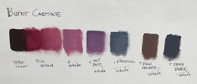
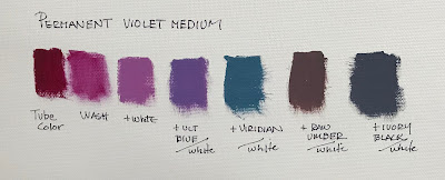
Burnt carmine, Permanent Violet Medium, Olive Green.      (Rembrandt Oils.)

Burnt Carmine   The best way to describe Burnt Carmine is it’s a “smoky” version of Alizarin Crimson.  

The carmine tells you it is part of the red family.  It’s much cooler than Cadmium Red, but warmer than Alizarin.  It is a beautiful addition to toning down the intensity of color in cool greens and blues.  It can also warm up browns and blacks without making them too much hotter.   It’s beautiful in shifting your warm greens and reds around.  Burnt Carmine can also help bring a color forward without having it turn too hot or orange.  I have been throwing it in many of my colors, just to see the result.  I love it and have been using it quite often.

Permanent Violet Medium.  This is a violet balanced on the red side of violet.  

This is another one of those colors that is excellent in altering some colors without turning them toward brown.  It is a great addition to shift your blues slightly toward a blue violet.  It can also downplay the intensity of your greens.  Try this color in your brown hues, or with the addition of black you can accomplish some beautiful grays.  Adding a very small amount of this to white creates a wonderful warm white when you don’t want it too hot.


Olive Green:  A very transparent green warmer than sap.

I received this color completely by accident, when the store I ordered it from accidently packed the wrong color in my order.  I decided to give it a try and found I really liked it.  It is a warm, yet very transparent and color, so its not one I use a lot, but it does have some properties that I really like.  It has the ability to push a color, rather than be a color.  By that I mean you would not choose to use this color by itself (or at least I wouldn’t) but it has beautiful warmth about it to move colors around.  Reds can move toward a rustier tone, it can transport your greens to something new and more vibrant.  It can push your blues to a warm and dirty aquamarine.  As I mentioned, it is used only on the occasions you want to warm a color with new and exciting results, as opposed to adding a yellow hue, you might experiment with this color.

Exploring with new colors is a great way to break away from old habits of color mixtures.  It will add freshness to your paintings.   It can create little shifts of color that help move the eye around without distracting the viewer, but instead engaging them to look more.  

Have fun and explore more.